
Selecting 10th
Edition – The first glimpses
By Richard Bland
This week, we have begun the long process (it’s still a year away folks!) of deciding what 10th Edition will look like, from the cards in it, the artists commissioned, to the basic land arts used. This year we seem to be being given a say in almost everything to do with 10th. So let’s have a look at what choices we’ve been given.
1) Card Choices –
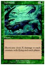
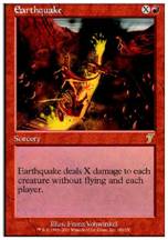
Hurricane Vs. Earthquake
The first decision is between 2 iconic board sweepers that have been around since Alpha. What would the inclusion of these cards do for the environment as 10th rotates in?
Hurricane
Green hasn’t had many constructed-worthy ways of dealing with fliers since the printing of Arashi, the sky Asunder who has seen main deck and sideboard play during the entire time he has been legal. At the time 10th rotates in, Arashi will be long gone and green may well be left without any decent flyer removal.
Earthquake
Red already has two very good board sweepers currently, pyroclasm and wildfire. Both of them being in the core set. If Earthquake is selected it is likely that one or both of these cards will not join it in 10th. The card itself is powerful, seeing constructed play throughout the times it has been legal.
While objectively Earthquake is more powerful than Hurricane, (gatherer yields at present 162 standard legal flyers and 571 non-flyers) the green (or blue!) board sweeper represents something green won’t have access to by the time 10th comes in, which is why my vote goes to Hurricane (besides I want to keep my pyroclasms)
2) Choose the artists for
the cards
We have been given the names of 8 cards listed that are confirmed to be in 10th. These are:
Howling mine
Might of Oaks
Nekrataal
These first four cards were all in 8th and 9th, and it is no real surprise that they return in 10th.
Vampire Bats - A cheap, if rather poor flyer, at lest it’s better than bog imp.
Fountain of Youth - A terrible newbie-bait life gain card, or SAVAGE AFFINITY ENABLER?!?! Unfortunately, it’s the former.
Lord of the Pit – Finally, a large iconic black creature (and MUCH more playable than the horrifically bad Yawgmoth Demon that got voted into 9th) It has very decent stats (7/7 Flyer for 7), which will ensure it sees play at least in limited. Whether it will see constructed play is debatable – its closest parallel, Invasion’s Devouring Strossus, saw play – and if Zoltan Boros and Gabor Szikszai get to do the art for it, it should look awesome too.
Incinerate – Finally its back! After disappearing off the map after Mirage block and being replaced by its retarded cousin volcanic hammer, incinerate will please all red mages. Its inclusion in the core set will likely spell the end for staples shock and volcanic hammer, as incinerate is too functionally similar to these cards to see them printed alongside it. Will this pave the way for Seal of Fire’s core set debut?
3)
We also gain the opportunity to include the basic land arts of our choice, with the restriction that only 1 of each type of land from the chosen sets will be reprinted. Unfortunately, this means that we cannot have all four of the fabulous Mirage plains.
Here is the link to the land arts in question:
Ravnica: http://www.wizards.com/default.asp?x=mtgcom/selecting10e/1ravnica
These lands, while stunning, do not really fit in with the other land arts that will be present in the vote. Some of the better arts here are Plains1 Island4 and Forest1
Kamigawa: http://www.wizards.com/default.asp?x=mtgcom/selecting10e/1kamigawa
Some very picturesque landscapes with minimal spoiling from the set’s theme, the mountains and forests in particular are extremely high quality (try to ignore the horrible islands) Highlights: plains3, mountain3, forests2&3
Mirrodin: http://www.wizards.com/default.asp?x=mtgcom/selecting10e/1mirrodin
Oh dear lord, my eyes! Mirrodin’s metal landscape really jars with the rest of the lands and the floating mountains really do not look good at all. Please do not vote for this. Highlights: plains4, Forest2
Onslaught: http://www.wizards.com/default.asp?x=mtgcom/selecting10e/1onslaught
Onslaught’s lands are not offensive to the eyes, but seem rather unexciting when compared to lands from sets such as mirage or odyssey, and the islands look almost cartoon-like Highlights: swamp4, mountain2, forest4
Odyssey: http://www.wizards.com/default.asp?x=mtgcom/selecting10e/1odyssey
Odyssey contains the most singularly striking plains ever (plains3) and several other high quality arts spread across the colours. This would be an ideal block to choose from, as all land types have something to offer, the best of the bunch are Plains3, Island4, Swamps 2&4, Mountains 1&4, and Forest1
Invasion: http://www.wizards.com/default.asp?x=mtgcom/selecting10e/1invasion
For such an excellent set, the land art is a little underwhelming, although the set has the best Swamp artwork of all the blocks. Highlights: The swamps, Island2
Masques: http://www.wizards.com/default.asp?x=mtgcom/selecting10e/1masques
I’m not a fan of this Block’s pastel style, especially on the mountains and swamps – I would rather not have any of those in the core set. Highlights: Island4 Plains4, Forest1
Urza’s: http://www.wizards.com/default.asp?x=mtgcom/selecting10e/1urza
Again a set with stunning plains art and while the forests leave a little to be desired, the spectacular mountain arts make up for it. Highlights: Island1, The plains and Mountains, swamp3
Tempest: http://www.wizards.com/default.asp?x=mtgcom/selecting10e/1tempest
These lands have a much darker feel when
compared to other sets, and I quite like the different style of the plains and
forests, and the plains in particular. Highlights: All Plains, Forest 3,
Mirage: http://www.wizards.com/default.asp?x=mtgcom/selecting10e/1mirage
Apparently it is easy to draw amazing
Plains art as this set shows (Wow, zebras!) The set’s
Overall, I feel that the top 4 are Mirage, Oddysey, Tempest and Urza’s (with Kamigawa a close 5th) I personally hope that as many of the Urza’s, tempest and Mirage block lands get printed just so I can get my hands on the foils!
4) Be the Brand Manager
Wizards are also giving us the opportunity
to vote in what they describe as “a fun vote that Brand really hopes turns out
a certain way, but you'll have the chance to overturn them if you want it badly
enough”
This leads me to believe that WOTC are brave (or foolhardy) enough to allow the
public to vote on some aspect of the product design – most likely the Expansion
symbol for 10th edition (I’d hazard a guess that Brand want the
symbol to be a “10”)
Overall, remember that only YOU can make 10th edition great! (R&D may play a small part as well)
-Richard Bland